
.png.transform/rendition-xs/image_image%20(1).png "Feder")
Dec 17 2019
Spanish Extra Virgin Olive Oil: The Complete Package
In the ever more competitive business of branding, selling, and exporting Spanish Extra Virgin Olive Oils, creative design is coming to make all the difference.
Traditional product, traditional presentation. For the longest time, this was the basic design concept behind every extra virgin olive oil ever bottled, labelled, and brought to market. Different producers use different techniques to draw the purest natural juice from different varietals of trees and fruits – Picual, Hojiblanca, Cornicabra, Arbequina each with its own distinct flavour. But there has always been a certain sameness to the packaging, with similar motifs and colour schemes recurring through the history of this particular agri-product: dark green bottles with images of mills, farmhouses, vistas of olive groves.
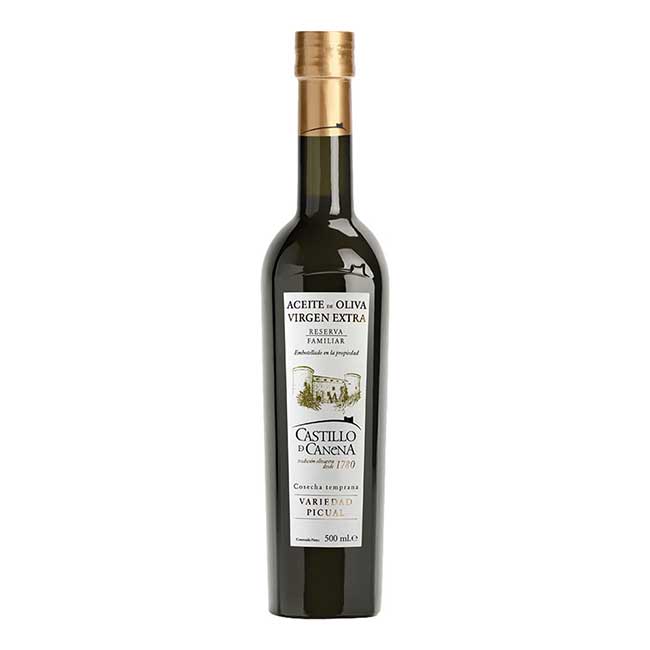
The Andalusian brand Castillo de Canena, based in the Guadalvivir River Valley, has more than two centuries of experience in the business, and the label on its Reserva Familiar oil is a prime specimen of this rustic-classic look. But the company was also well ahead of the growing trend toward more stylised contemporary designs, releasing its “first day of harvest” EVOO in a striking cherry red bottle way back in 2006, at a time when nobody else dared to stray so far from the standard, muted earth tones.
“With many more brands on the market now, customers can be confused when they’re standing in front of the EVOO shelf,” says Castillo de Canena’s UK and US export manager María Parias. “Packaging can help them make a buying decision, but also to get across the concept, the story of the brand. In our case we want to bring the customer to our land and our castle amid the olive trees of Southern Spain.” While the Reserva Familiar bottle achieves this with some elegance, Paras and co employ alternate strategies for the many other oils in their range, including a conspicuously fresh and funky label for their Bio-Organic EVOO. Some of these are designed in-house, others are contracted out to graphic studios like Ideologos or Andi Rivas.
“Our aim is to communicate the value of each product through colour, texture etc,” says Paras. “The coordination of image, wording, dark glass … there are many ways to play with these ingredients.” Over the last half-decade, aesthetic innovations along these lines have been noted and ranked by expert juries and judges for the annual EVOOLEUM Guide To The World’s Top 100 Extra Virgin Olive Oils.
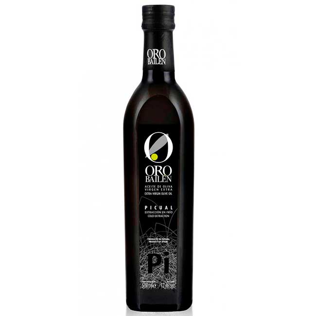
The forthcoming 2020 guide confirms that Spain still very much leads the field in terms of producing the best-tasting oils – 81% of the list is of Spanish origin, including eight entries in the top 10 and the year’s number one ranked EVOO, Oro Bailén Picual, from Jaén.
But EVOOLEUM was also the first such contest to include multiple award categories for packaging and design, reflecting “a real creative evolution over recent years”, according to event director Pandora Peñamil Peñafiel. And again, when it comes to actually presenting this “liquid gold”, says Peñafiel, “Spain is leading the industry.”
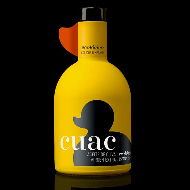
“I think that EVOO producers are leaving tradition aside. They want to be associated with the olive tree and millenary history, but they also want to break the mould, to be modern and expressive.” Take, for example, the 2020 silver medal winner for Best Innovative Design: the organic oil Cuac, by Verdejar. Graphic studio Cabello X Mure put a rubber duck on the bottle instead of anything remotely agricultural, adding a gummed finish and a beaklike peak on the stem that really tickled the jury.
The gold medal winner for Best EVOO Premium Design, meanwhile, is Arbor Sacris, extracted by Mil & Un Verd from the millenary olive trees of Taula del Senia in Catalonia. Its packaging was selected for its “clean and almost literary set, with a graphic aspect that refers to the olive grove and the earth, and where the drawing of the trunk combines perfectly with its golden and black and white tones.” The traditional EVOO package, in other words, elevated to a true work of art. That work was done by the Tarragona-based studio Debonatinta.
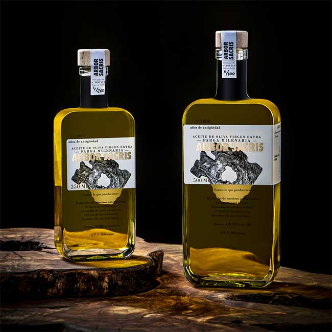
“We wanted them to highlight the quality of the product,” says brand spokesperson Marta Rius. “That is, millenary olive oil catalogued and certified by the Farga Milenaria Guarantee Mark.” The finished design is drawn from the beauty of those 1000-year-old trees, and the passage of time recorded in the rings of their trunks. Even with a premium EVOO like this – where production itself is strictly limited and each bottle is somewhat “exclusive”, it can still be difficult to “stand out”, admits Rius. “We’re seeing lots of different designs, and very elaborate labels.”
“Packaging is increasingly important as a means of making a sale. But in the end it is commitment to quality that defines a brand of extra virgin olive oil, and high-level design must be in tune with high-quality product. In that reguard, the customer cannot be deceived.”
Text: Stephen Phelan
RELATED ARTICLES
RELATED RECIPES
